Fractured Self Portraits
Using 8” by 10” photographs, each student traced a simplified contour drawing of their face. They transferred the drawings onto colored paper and “fractured” them by dividing the picture into small sections. Each fractured section became a separate area where we added tones with colored pencils.
Students tried to achieve a range of value, (dark to light tones,) in each section. They were limited to using white and two colors that were analogous to, (in the same family as,) their chosen paper color. When done correctly, the finished portraits are defined more by color and value changes than by the lines themselves!
Here are some more details on how we do this! First of all, I take portraits of all my students using my iPhone camera. I crop them so that when I print them out as 8” by 10”s, the facial features will be large and clear enough to trace. Alternatively, you could let your students take selfies and share them with you via Google photos or whatever technology you are comfortable with.
Once the photos are printed, students use pencil and tracing paper to capture their main features. I stress the importance of clean, contour lines and how to trace “just enough” to replicate the essence of their faces.
Students Tracing their Photos onto Tracing Paper:


Next, using good old fashioned carbon paper, we transfer the simplified tracing onto an 8” by 10” colored sheet of construction paper. Once the students have their image transferred onto their colored paper, they use a thin Sharpie to go over all their lines.
The photo below shows a student sample that includes the photo, the simplified tracing, and the transferred, Sharpied portrait on the student’s chosen colored paper.

Next, students must “fracture” their image with pencil using one of the three methods shown below: “Circles”, “Rays”, or “Funky Grid”.
NOTE: The fracture lines should be distinct and precise, but DO NOT Sharpie them!

Before starting the color pencil work on their portraits, the students must demonstrate their skills at controlling value. Here is a picture of an exercise they must complete successfully before they are allowed to start working on their portrait. Since they will be working with colors that are analogous to their paper color, I have them use two of the colors they plan on using on their actual project, (They ultimately may use three colors, and white if they wish.)
Notice my additional reminder on the right, where I emphasize that the color of the paper should show occasionally. In addition, one section can have more than one color, fading from opposite sides/corners.
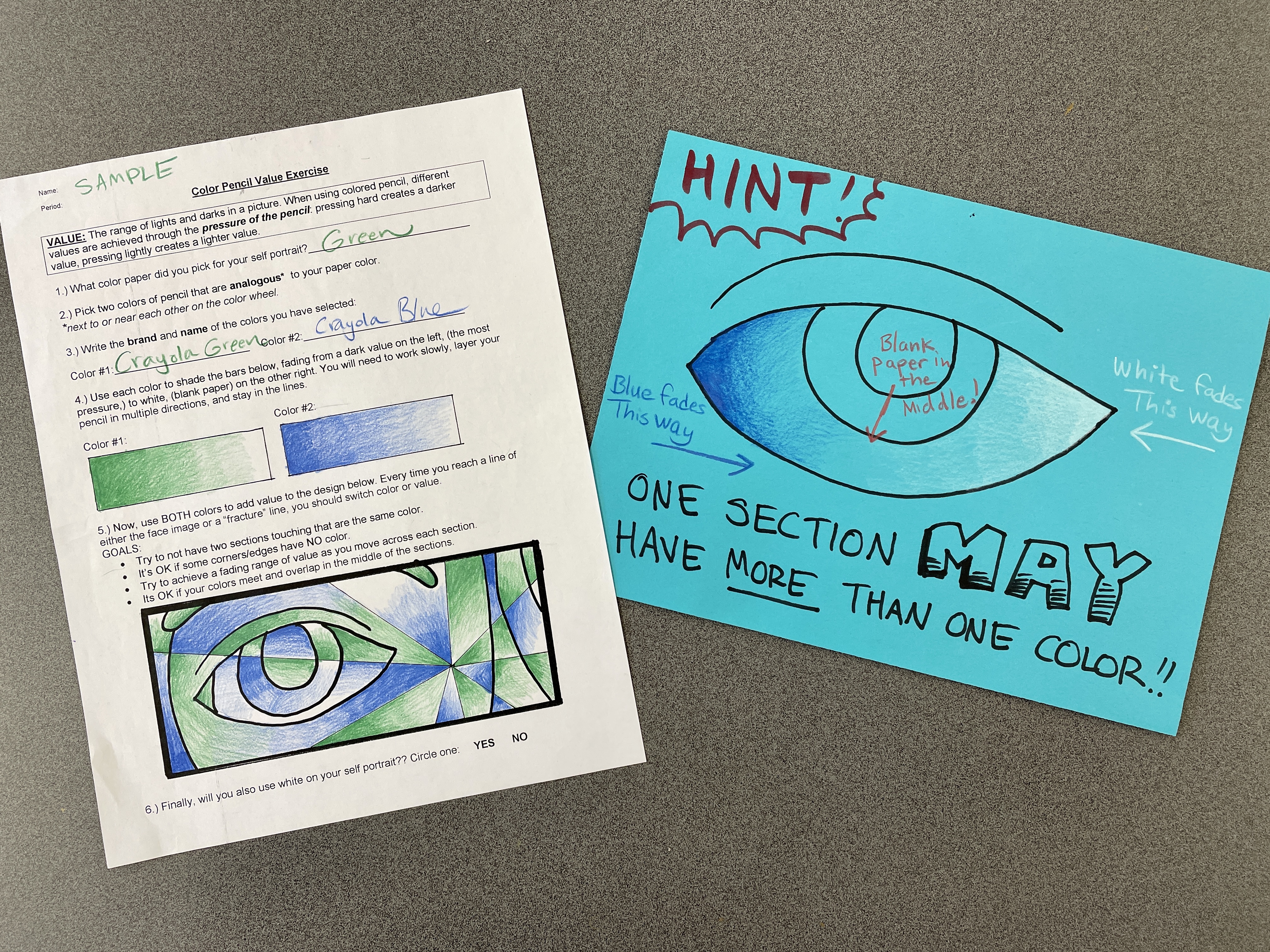
CLICK BELOW FOR A PDF OF THE VALUE EXERCISE SHOWN ABOVE:
Fractured Self Portrait VALUE EXERCISE
Once they demonstrate their ability to neatly show a range of value and have found ways to distinguish the sections on the practice exercise, they may begin coloring their fractured portrait.
EVERY TIME THEY HIT A FRACTURE LINE OR PORTRAIT LINE, THEY MUST CHANGE COLOR/VALUE.
In addition, the goals they should meet are as follows:
- Limit colors to two or three that are analogous to their paper color.
- Allow the paper color to show in places.
- Work slowly and neatly to show smooth transitions of value.
- Make sure that two side-by-side sections are not the same color/value.
In regards to the background, students may keep working with the same colors, swap out one or two to increase contrast, or switch to an entirely new (complementary) color scheme for maximum contrast!
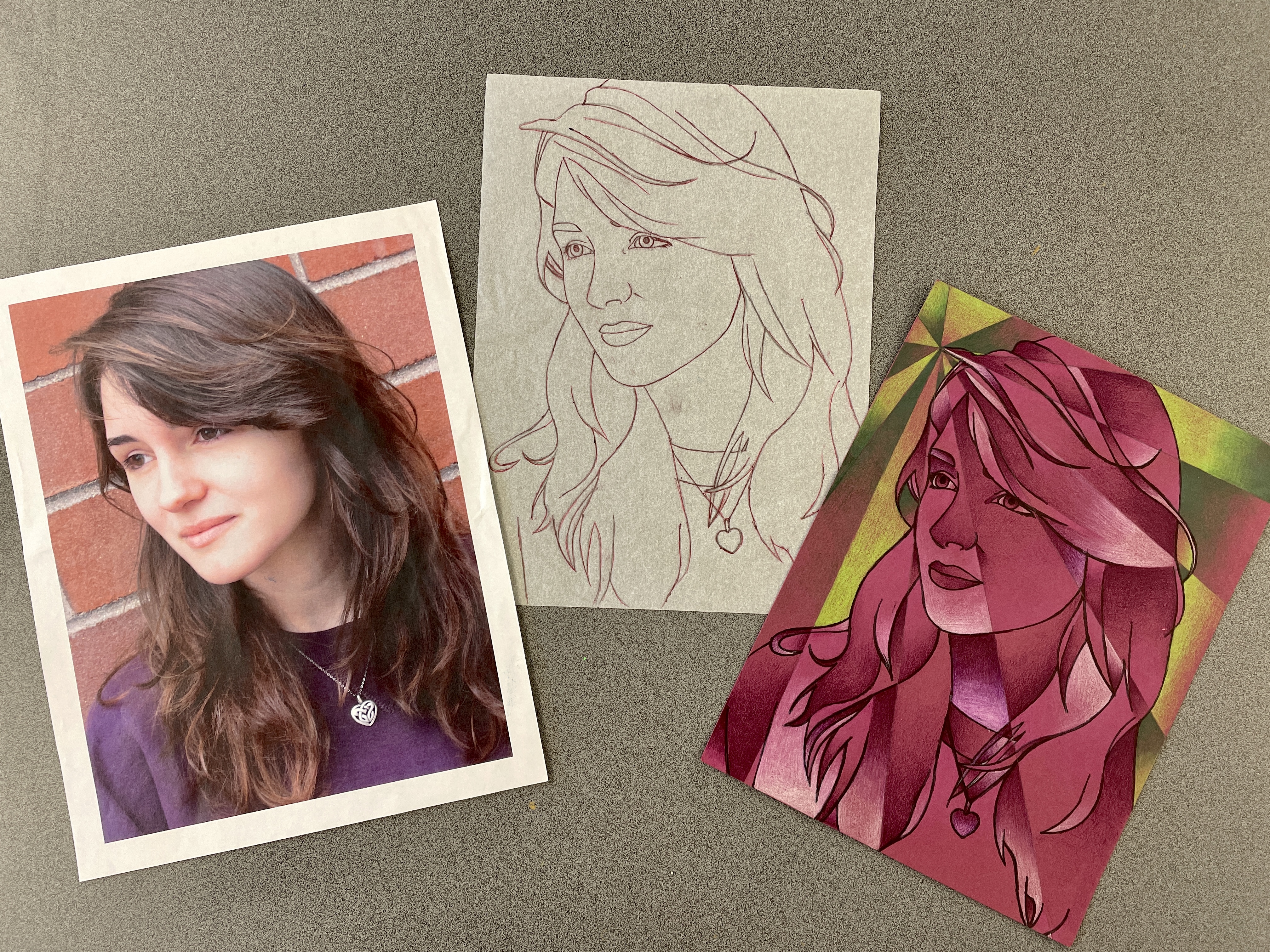
(The above example created by my senior intern class assistant shows original photo, simplified tracing, and final Fractured Self Portrait.)
– – –
Proud Students!

Sep 16, 2019 @ 21:37:49
This is a wonderful project! How did you transfer the portraits to the color paper?
Sep 16, 2019 @ 22:10:39
Good old fashioned carbon paper!!! Then sharpie over the lines for a “clean” outline look.
Dec 03, 2019 @ 09:56:06
Hi! Love this. Did you limit them to the 2 analogous colors + white within the actual person and then let them choose other colors for the background?
Dec 03, 2019 @ 20:11:23
I usually suggest a contrast for the background to help the portrait “pop”, such as the complements of what they used on themselves, though some kids stay in the same color scheme, with a slight change.
Dec 16, 2019 @ 04:30:36
Thank you – Tried this with my 7th graders, love them!
Aug 27, 2021 @ 01:47:05
What size and type of coloured paper was the portrait transferred onto?
Aug 29, 2021 @ 22:19:59
8″ by 10″ (actual size of printed photos,) and I use Tru-Ray construction paper for the base.
Jan 26, 2022 @ 15:09:34
Do you have a step by step guide??? These are INCREDIBLE!
Jan 26, 2022 @ 19:35:37
Hi Sophie, Since changing the format of this site to be more of a resource for fellow art educators, (and not just a showcase of student work,) I haven’t re-done this post to show more of the step by step process I use, sorry! If you are comfortable emailing me your cell # to uamsler@masconomet.org, I can text you some pictures of the posters/instructions I have!
Feb 15, 2022 @ 22:57:10
If you haven’t noticed, I added some instructions for how to do this Fractured Self Portrait Lesson!
Aug 29, 2025 @ 02:58:35
Hello! What grade do you teach this with? Im wondering if I could maybe do this with my 6th graders…
Aug 29, 2025 @ 03:12:29
every project you see here is done with seventh graders!
Aug 29, 2025 @ 03:12:07
every project you see here is done with seventh graders!